While test-driving this new theme, something peculiar has come to my attention...
The theme's supposed to display like this:
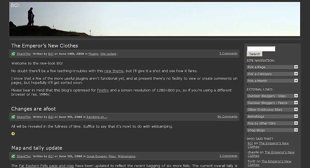
but sometimes it displays like this:
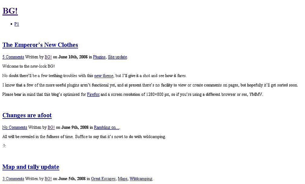
I would appreciate people letting me know what they see. If it's not working right, I'll repair or replace it.
THE SMALL(ish) PRINT... (updated 23/07/2016)
By submitting a comment to this blog you grant me permission to reproduce its content and to reproduce the submitted name/URL in attribution. I will leave your content in its intended place and in its unedited form unless one or more of the following apply:
If you ask me to modify, move or delete your content, I’ll consider making the requested change(s) so long as there’s no significant alteration of the context of the content or of any debate associated with it;
If you change your email address or URL, I’ll update these details in older comments so that I'm not displaying dead links;
If I decide to change the theme or layout of this blog, thus affecting the placement and/or visibility of comments, I’ll make whatever changes I see fit for the smooth running of this blog;
If any comment contains insulting profanity or other content which I deem to be causing or likely to cause trouble, I’ll edit or delete as I see fit for the smooth running of this blog. I’ll try to remember to display the reason(s) for whatever editing I do, so that folk aren’t left hanging wondering what happened and why. If you can at least try to "disguise" your swearing, it would be much appreciated.
Other things to consider:
Comments must contain at least 3 characters;
You can use some code in comments, feel free to give it a shot and see what works;
If adding pics, the recommended maximum dimension is 600px.;
Comments containing many links will be held for moderation;
I reserve the right to amend this policy in line with proven applicable current legislation;
Free Speech: you may well have the right to it, but you've no right to compel me to a) listen to it, or b) publish it!





It all seems to work well with Firefox beta 3 RC1, BG. Hang on, let me try IE6... yes, that seems to render well enough, too. Both run on XP (not sp3 yet).
Looks fine in Firefox 2.0.0.14, Opera 9.27 and IE7.
The page does generate a script error though in all browsers:- 'st_go' is not defined.
Thanks, folks, your feedback is much appreciated.
Geoff - I looked through all my files for any reference to "st_go", I can't find it anywhere.
Here is an extract from the MS Script Debugger, containing the st_go call:-
The theme is a modded version of Nick Berlette's Syrup.
st_go({blog:'1681275',v:'ext',post:'0'});
var load_cmc = function(){linktracker_init(1681275,0,2);};
if ( typeof addLoadEvent != 'undefined' ) addLoadEvent(load_cmc);
else load_cmc();
Hmm... so does that mean that there's tracking code buried in here somewhere? If so, should I hack it out, or just let it be?
That code is to do with the WordPress Stats Plugin - no idea if things will work OK without it.
Anyway it's unlikely to be the cause of the incorrect blog display I would think.
I'll disable the wp-stats plugin anyway. Cheers, Geoff.
Does the incorrect display sometimes happen for you, or was it only reported by one of your readers?. If it happens for you, have you looked at the Firefox Error Console immediately following the duff display?. That should help to pin it down (Tools -- Error Console).
I can see it fine in IE7
😀
Looks fine in Opera. Smiley images above this comments box aren't loading though, nor are the Wavatars (whatever they are) below it.
HTH.
For what it's worth, I think the left edge is poorly defined. A different background and/or border for the container div as compared to the page background would sort that out though.
Hi MJ
Wavatars and smilies should be working now.
I agree with what you say about the left edge, I've been trying to get it sorted better, and to get the ends of the comment list, comment input and comment span info areas aligned with it, and also to move the comment list so it's above the input area... all to no avail. I've no doubt that it's easy for somebody like you, but it's beyond my tinkering ability. No great shakes, though, it's only a pile of 1s and 0s, hardly important on a cosmic scale.
But if it's important to you, I'll let you have temp admin rights so that you can sort it. 🙂
I get the black version. Unfortunately
🙄
Quit moaning, JH - it's light at the top!

> But if it’s important to you, I’ll let you have
> temp admin rights so that you can sort it.
Heh - I actually did have a quick look at it. Sad.
Your layout seems to be, ermm ... evolved. :O)
The container div sort of isn't and there's some mad padding coming from somewhere or other. However, this is beside the point. Find the div.post contextual selector in your style sheet and try adding 'border:1px solid #444;' (without the quotes) to is declaration. That should put a faint line around the posts and effectively create a guiding line of sorts to the left of the page, while not really having to change the layout at all which saves a lot of hassle.
HTH.
PS - feel free to give me a shout if that's all gibberishy shite
Many thanks, Jim. Done more-or-less what you said, the left edge now looks a lot better. Right edges (next to sidebar) are better too, except around comments/leave a comment area when not in fullscreen, but hey, I can live with it. 😎
Next, I'm off to hack the code to get the comment list above the "leave a comment" area. Wish me luck!
Ach, I liked it better before Mad Jim started footering with it.
😆
All white and different again? Hope you can fix it. The other day it was fine.
Due to a data and backup corruption, it's all gone tits-up. Looks like I'll have to start from scratch again.
😥
I'll load a different theme until the repairs are done.
Sorry to hear that, if it’s any consolation I’m still trying to work out the final layout for my blog.